
The BBWAA Website Needs An Upgrade – Badly

Much has been made about the antiquated and unfair voting process for selecting new members of the baseball Hall of Fame.
But what can you expect from an organization – the Baseball Writers’ Association of America – that presents itself in the most antiquated way imaginable? Just days away from 2015, this is what the BBWAA home page looks like:
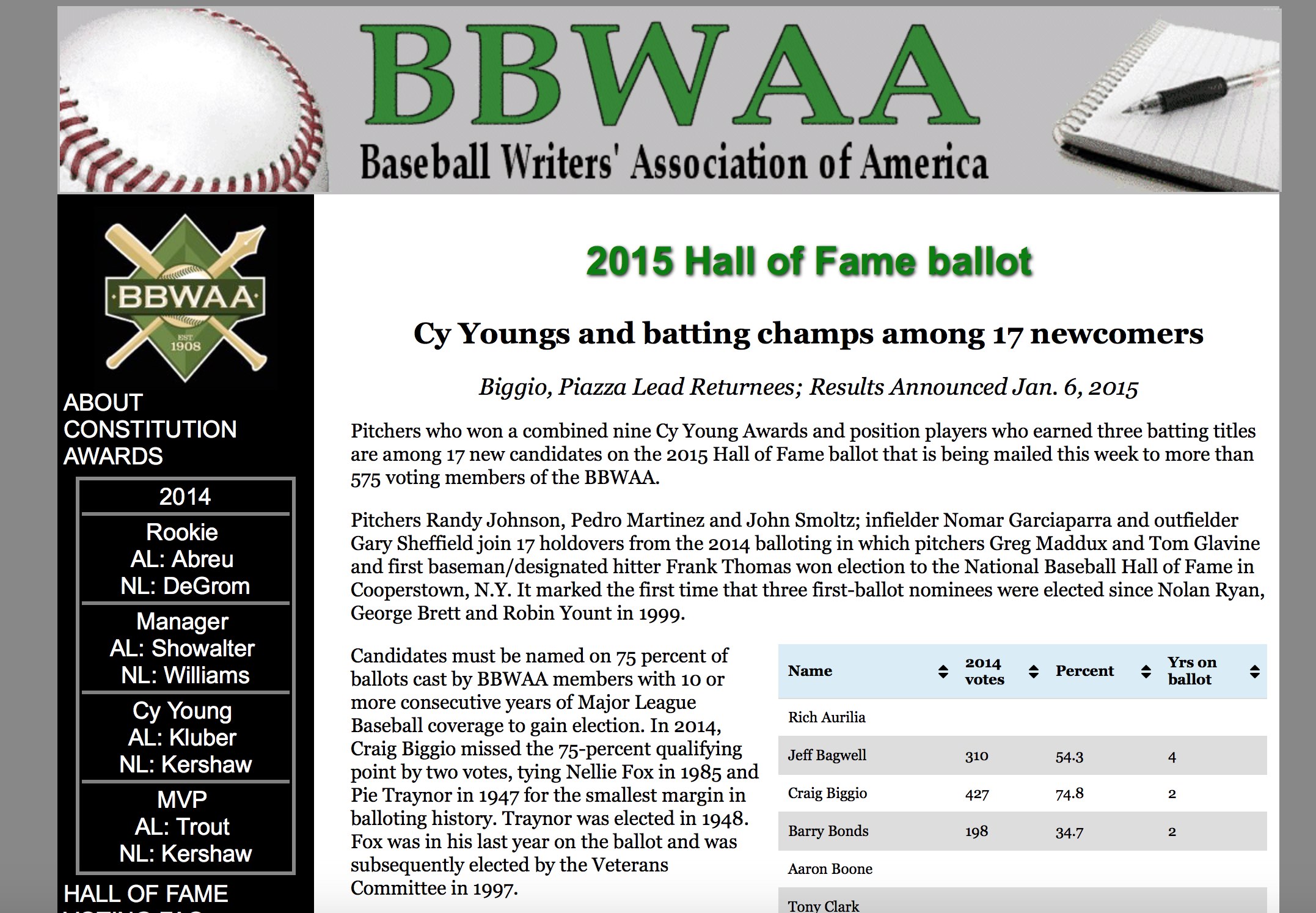
Yikes.
And it’s not just the total package. This is the header:

And their logo:
Yep, that’s a fountain pen in the logo. Not a horrible idea, but lousy execution.
Here is how they display the year-by-year results:
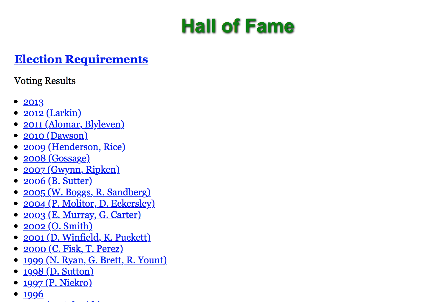
Note: The 2014 class is not included (to be fair, the election results came in just under a year ago).
Also, they couldn’t do some graphic-based presentation? Photos of players selected by year? Their Hall of Fame plaques? Something?
And this is what their page detailing the history of annual awards looks like:
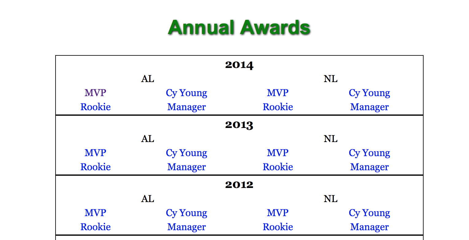
Come on, guys. We understand the BBWAA is not a heavily funded organization. But funds are not what they need here. It’s want-to.
We could put together a more attractive page for you in one day. One. Day. And we would do it for free – because we love baseball, and baseball deserves better than this.
Few things so vividly illustrate an organization’s mindset and inability (or willingness) to adapt to modern times as its website. And the BBWAA’s website is a dinosaur.
Oh, and one other thing:
All Hall of Fame ballots must be “postmarked” by today – which raises the question: Why do voters have to freaking mail them in? It’s 2014
— TOOTBLAN/Ball Eight (@TOOTBLANTime) December 27, 2014
And some answers:
@TOOTBLANTime this is to accommodate all the dinosaurs who don’t believe in fax, email or xFIP
— Rice Cube (@CubicSnarkonia) December 27, 2014
@CubicSnarkonia @TOOTBLANTime you can’t trust the World Wide Web or kids who still live in their parents’ basements making up stats
— Johnathan (@JSlip1) December 27, 2014
Seems right.
