
The Pitching Series: Efficiency

Last time on The Pitching Series, I used a photo of someone most of you should know as the header photo. It was MLB Hall of Famer Greg Maddux, and I used his image because he’s someone who was considered a master of commanding the baseball. I bring his name up again because he is also remembered as being an incredibly efficient pitcher – nowadays, a complete-game shutout where a pitcher throws fewer than 100 pitches is referred to as a “Maddux”. Greg did this 14 times in his Major League career (according to the B-Ref Play Index), far and away the most ever (at least, since 1914). In fact, Greg has as many Madduxes himself than the next two men behind him (Zane Smith and Don Newcombe each had 7). If these past few sentences (or, y’know, the title) didn’t tip you off, this installment of the Pitching Series will be looking at efficiency.
In the last two parts, we looked at factors that are dependent chiefly on the pitcher – velocity and control. In this piece, we’ll instead be looking at something that has a bit more involvement from the batter. So instead, we’ll mostly be looking at how a variety of statistics influence efficiency, instead of the other way around. Additionally, I did a bit more planning with this piece that I believe will lend itself to making for a more directed, concise article.
In keeping with the format of the first two Pitching Series pieces, we’ll first examine the relationship between efficiency and results in terms of ERA, FIP, and SIERA. However, we first need to find a way to statisticize (I did a little research and discovered this might actually be a word – it first appeared in a Farmer’s Almanac in the 1800’s – pretty cool!). I came up with three different ways of measuring “efficiency”, which we will soon discover may not be created equally (as their creator, I’ll take the blame for that one). These three measures are Pitcher per Batter Faced, Pitches per Out, and Out Percentage.
Pitches per Batter Faced is as simple as it sounds – the number of pitches thrown over the season divided by the number of batters the pitcher faced.
Pitches per Out is also pretty simple, it’s the number of pitches thrown divided by the number of outs the pitcher recorded. I didn’t use only the outs the pitcher recorded, either – I used ALL outs made with the pitcher on the mound. This number is easily reached by multiplying the number of innings pitched by three (and then painstakingly adjusting by a few for every pitcher because Microsoft Excel doesn’t know that “.1” and “.2” really mean “.333” and “.667” in baseball terms).
Out Percentage is the number of outs recorded divided by the number of batters faced over the course of the season. Again, I used the same method as above for calculating “outs”.
So, as I mentioned before, we’re going to look at how efficiency stacks up against ERA/FIP/SIERA. However, this time instead of rolling out clunky graphs for every stat under the sun, we’ll look at correlation in table format before deciding to investigate any further.
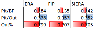
I suppose this would be self-explanatory if not for the OBNOXIOUS colored bars marring the beauty of my little table. However, the bars are a good visual to demonstrate relative correlation. For each of the following tables, the bars are sized relative to their value in relation to the rest of the values in the table. The red represents a negative (or “inverse” for you statistics sticklers out there) relationship, the blue indicates a positive (“direct”) relationship.
So, there are two things here that should stand out immediately. First, that the first and third rows are completely red (inverse) and the middle row is blue (direct). Second is that the last row’s value are way larger (and therefore indicate much stronger correlation) than the other two rows.
The second observation is easier to explain, and it’s pretty obvious. All other things aside, the guys who have hte best Out% are going to be allowing the fewest baserunners, and therefore the fewest runs, and therefore have better ERA/FIP/SIERA. That’s common sense.
The second observation requires a bit more consideration, but we can boil it down by just putting the stats into words and using a but more common sense. The first row shows us that as Pitches per Batter Faced increases, ERA/FIP/SIERA decrease, albeit slightly. Why? Well, better pitchers get more strikeouts, which require more pitches than giving up a single (or a homer) does. However, the R values indicate a very weak correlation and when you look at the graphs of these relationships it kind of just looks like a big cluster of dots – I’m actually surprised the R is as high as it is. I wouldn’t worry too much about that, but it is a little interesting. As for the second row, it’s telling us that as Pitches per Out goes down, as does ERA/FIP/SIERA. This makes sense, because the more hits and walks you allow, the more pitches you throw in an inning – while still only getting three outs. In the last column… well, I already explained that. Moving on!
So, as we can see, there’s really not much to learn there except some things we probably already knew. Now we’ll look at how efficiency relates four different aspects of pitching and evaluating the interesting data (if any) before making out conclusion. The four aspects are K and BB rates, swing and contact rates, batted ball data, and individual pitch data. First, K and BB rates (I threw in fastball velocity just because I couldn’t figure out anywhere else to put it, but as you can see the numbers are pretty insignificant anyway).
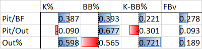
The first thing that jumps out at me is the BB% column. Instead of alternating like the entire first table as well as columns one and three of this table, the first two rows are both directly related. However, this makes sense when understanding the context – the more walks you have, the more pitches you are going to throw no matter what. Additionally, the more walks you have, the smaller percentage of batters you are going to get out, which explains the last row being so different from the first two. When then looking at the first column, we see that higher strikeout rates lead to throwing more pitches per batter, but fewer pitches per out. This is explained by the third number, which shows that pitchers with higher strikeout rates get more of their batters out. That means that while they’re throwing more pitches per batter, they’re getting more of those guys out, which reduces the number of pitches needed per out. However, the third column shows something even more interesting. When it comes to efficiency, having a good K:BB ratio is better than just having a lot of Ks. This makes sense. Let’s now take a look at efficiency and swing/contact rates.
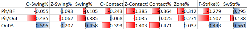
Here we have a bit more data to digest, so I’ll try to only focus on what’s important. Going from right to left, we see that O-Swing% seems to have a pretty good impact on efficiency. As O-Swing% increases, pitches per out decreases and out percentage increases. In other words, more swings outside the zone leads to more success, which is exactly what we found in out last piece. Z-Swing% seems to be relatively unimportant in terms of efficiency, which makes sense, cause Z-Swing% is pretty even throughout the league. When it comes to total Swing% the results are the same as with o-Swing, which makes sense because O-Swing accounts for most of the variance in Swing% anyway. The contact section as a whole is pretty consistent, which is convenient because we can just about skip over the O/Z components and go right to Contact%. What we initially see here is that getting more contact leads to fewer pitches per batter faced – exactly what our old pal Greg Maddux specialized in. However, what’s interesting is that it seems that those pitchers have less success than those who miss bats more often, which is not similar to what Mr. Maddux did. However, when you think about it, it makes sense – more balls in play gives the offense more chances at getting on base and scoring. Pitchers like Maddux who gave up lots of contact and still got outs are few and far between, especially in today’s game. Moving forward, we see that throwing more pitches in the strike zone decreases the number of pitches per batter faced and per out, but has pretty much no influence on out percentage. First-pitch strike percentage similarly reduces the number of pitches needed per batter and per out, but does seem to have a good influence on getting guys out. This is a skill preached by pitching coaches from little league to the majors, and (surprise!) it seems like they might be on to something. Lastly, increases in swinging strike percentage bumps up the number of pitches per batter as well as out percentage but reduces pitches per out, similar to K%, which is no surprise because whiffs and Ks go hand-in-hand. Now a look at batted ball data.

So there isn’t a lot to see here outside of one glaringly obvious relationship between lower BABIP and higher out percentage. Outside of that, we see that none of these batted ball stats influence efficiency much (which is good, because it helps support the idea that a pitcher has more control over efficiency than we might’ve thought). The one note I might make is it seem that ground ball pitchers are more efficient, generally, but not by too much. Even then, the out percentage numbers are even weaker than the “pitches per” numbers, so it might not even mean much. I also should point out that I expected the relationship between line drive percentage and out percentage to be a bit stronger than that, but I digress. Lastly, we’ll look at efficiency and individual pitch values.
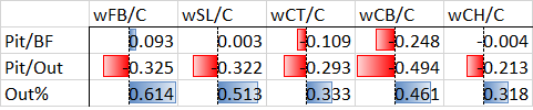
First, for those of you not familiar with FanGraphs’ pitch valuation system, what are you even doing here? No, I kid, but it’s actually a pretty interesting system that rates individual pitchers’ pitches based on how they perform relative to league average and how many runs above or below average they are. They have an aggregate and a rate stat for this pitch value, and what I used is the rate stat which averages the pitches’ value per a certain number of pitches (100, I think). Unfortunately it doesn’t help us much here – we know that the better your pitches are, the more outs you are going to get, which is why the last row show a strong direct correlation across the board. That also explains why pitches per out goes down as pitch value goes up. Interestingly enough, it seems that none of the pitches really have an impact on pitches per batter faced, except for curveballs. Which, come to think of it, thanks out as influencing pitches per out way more than any other pitch does. Is this the big discovery – having a good curveball is the key to efficiency? Probably not, but it’s definitely interesting to see. In the end, an R of 0.494 isn’t even out of the “weak” category on its own, it’s just stronger compared to the rest of the (very) weak Rs in this group.
No, let’s take this research meta for a second. We looked at out measures of “efficiency” compared to a ton of other stats, but we never looked at them compared to each other! So, I suppose it might be beneficial to do that. Maybe I should have done that before all of this. Whatever, I’m doing it now.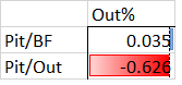
Wow! Whoa! Okay, that explains a lot. It also makes me question 1/3rd of what we just did here, but I’ll get over it. Anyway, we can see that out percentage, what we originally identified as being the best predictor of ability/success in our first table, isn’t related to pitches per batters faced, like, at all. So basically pitches per batter faced is fun to look at but tells us nothing about the pitcher’s ability! However, we can see that pitches per out is pretty well related to out percentage, so at least that part of the exercise was worthwhile.
So, what can we conclude from these ~2,000 words? First, Increasing K:BB (preferable by limiting walks), inducing swings out of the zone, and throwing first-pitch strikes are most effective at making you efficient as well as effective. Throwing lots of pitches in the zone and getting lots of contact will keep you relatively efficient per batter, but isn’t as successful an approach. Next, we see from the batted ball data that efficient success is mostly independent from batted ball factors (but ground balls might give a slight advantage over fly ball). This means that while the batter has more control over your efficiency than he does your velocity or control, a pitcher still can influence his efficiency himself. Lastly, we found out that the curveball is the most important pitch when it comes to efficiency (take that for whatever it’s worth, which probaby isn’t much, but the numbers back it up)!
I’ll leave you with a final parting gift: all five three-row graphs in this article, combined into one, with the data bars adjusted relative to all the values in the table. Just for kicks.
![]()
You probably can’t even read it, but if you right click an open it in a new tab you should be able to scroll through. Enjoy!
So, I totally failed on the “being more concise” part of this article, but I think it feels better without all the awkward graphs. Honestly, I wasn’t sure I was going to continue the Pitching Series before I wrote this piece but I’m feeling a bit better about it now. Look for Part Four sometime next week, perhaps Monday or Tuesday.
As always, if you’re interesting in looking into any topics I missed in this piece, leave a comment or get at me on Twitter @mwojciak21 or @MRRblog or @realDonaldTrump.
In case you forgot, all of my statistics are taken from Baseball-Reference, FanGraphs, Baseball Savant, and Brooks Baseball.
Thanks for reading and be sure to check out Part 1 and Part 2 if you haven’t already!
