
The Pitching Series: Control

Warning: Graph Intensive Post – not suitable for the consumption of those intimidated, frightened, or disgusted by heavy statistical analysis. Proceed at your own caution.
In the first installment of The Pitching Series, we took a look at how fastball velocity correlates to success in the major leagues (spoiler: it doesn’t). However, we did learn that throwing hard does seem to correlate to getting more strikeouts, allowing fewer hits, and generating less contact (per swing) than softer-tossing pitchers. The reason this doesn’t strongly correlate to success (in terms of looking at ERA/FIP/SIERA) is because pitching is just too complex. Outside of the statistics I just mentioned, it seems like pitching is a level playing field (when it comes to velocity) and the multitude of factors beyond these few stats is the great equalizer.
Now, we turn our attention to what is generally the companion topic when talking about velocity: control. Usually you hear people talking about “command” instead of “control” these days, and these are two very different topics. Command refers to the ability to put the ball where you want it, whether that’s in the strike zone or out of it. This is a pretty qualitative concept, and there’s really no good way to statisticize (spell check tells me that isn’t a word, but I’m rolling with it because I think it sounds great) it right now and I’m not sure there ever will be. So writing an analysis/statistics article on command would be near impossible, and likely contain far too much of my own (often incorrect) opinion. So instead, this piece will look at control, which is generally thought of as simply the ability to throw strikes.
I’d like to lead this post in a similar direction to the last one (but hopefully finish up with a more concrete conclusion). Therefore, let’s first look at how strike percentage relates to ERA, and then our favorite ERA predictors FIP and SIERA.
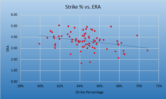


Once again, we can see that throwing strikes doesn’t strongly correlate to having a good ERA. We also can see again, albeit less obviously, that FIP correlates to our constant variable (great oxymoron) better than ERA, and SIERA even better than FIP. If it means anything, the R values for ERA/FIP/SIERA are as follows: -0.311, -0.373, -0.442. So, still in the “weak” range we outlined last time, but better than fastball velocity. Keeping in line with the last post, let’s now look at how strike percentage relates to strikeout percentage, walk percentage, and hits per 9IP.


What we have here is not really a surprise. Higher strike rates can lead to higher strikeout percentages, but there’s too much variance to make any strong correlation (R=0.322). However, there’s definitely a strong correlation between throwing strikes and walking fewer batters – this is absolutely not a surprise at all. Lastly, we see that there’s not really any connection between throwing strikes and giving up hits (R=-0.218). So now that we’ve covered the basics, let’s see if we can dig up anything that might be interesting to us.
One interesting statistic that FanGraphs offers in its “Plate Discipline” section is called Zone %. This is the percentage of pitches thrown that actually pass through the strike zone, according to FanGraphs’ data (they also offer the same stat, but from PitchF/X). I thought it would be interesting to look at strike percentage compared to this zone percentage. The results may surprise you.
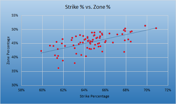
Interestingly enough, there isn’t a “strong” correlation between the two stats, in the traditional sense. While it’s strong compared to the rest of the graphs we’ve seen, it’s still on the lower end of the “average” range defined in our last post (R=0.604). This is interesting because it shows that sometimes throwing the ball out of the zone can still be effective. In fact, Francisco Liriano had the lowest zone percentage of any qualified starter in baseball this year, at just over 36%. Amazingly though, he managed to have a better strike percentage than guys like Tom Koehler, whose zone percentage was just over 45%. Additionally, the next-lowest man in terms of zone percentage was none other than AL Cy Young Award winner Dallas Keuchel – with a zone % and strike % of 38.0 and 63.1, respectively. It’s no surprise that each of these guys throw a primary pitch with lots of movement – Liriano has a good two-seam and Keuchel leans on his outstanding sinker. Both also feature plus sliders, which often get players to swing at pitches out of the zone.
So basically, when looking at this particular graph, the most interesting part is not really the relationship between the two variables, but the relationship between the individual points and the trendline of the graph. Points below the line get more strikes than the data predicts they would, and points above the line get fewer. The difference between the predicted zone percentage and the actual zone percentage, represented by how far off the trendline the points are vertically, is called the residual value of the data. In this case, a positive residual means poorer performance and a negative residual means better performance. So, how do our residuals stack up against actual performance?

So, there’s not too much to see here. The correlation is weak (R=0.266) but it is positive, which indicates that pitchers who get more strikes out of the strike zone should have lower ERAs. In our last two examinations of ERA, FIP, and SIERA, SIERA was most strongly correlated to our independent variable. When looking at the R values in this case, I see that the trend continues. Let’s take a look at the graph.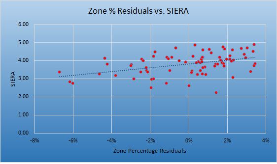
That’s a pretty good connection. The R value isn’t great (0.428) but it’s something. As a whole, these last two graphs tell us something important. They show that the ability to get strikes on pitches out of the strike zone is just about equally as valuable in predicting ERA/FIP/SIERA as fastball velocity or strike percentage. This isn’t something that’s often achieved with a fastball, so secondary pitches are a large factor in determining how good a pitcher is going to be in this regard.
Now, let’s take a quick look at why throwing “strikes” out of the zone is so effective. Here are two sets of graphs, first the relationships between strike percentage and swing rates, then our zone percentage residuals and contact rates.
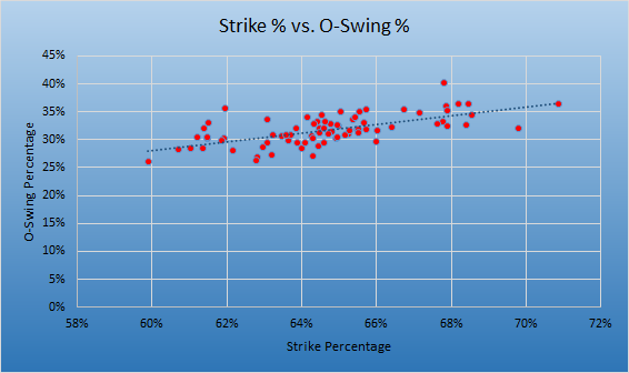

Let’s first break down what we see here. Here we have two pretty strong relationships between strike percentage and the different swing rates. Interestingly enough, the more strikes you throw, the more swings you get out of the zone. You also get more swings total.
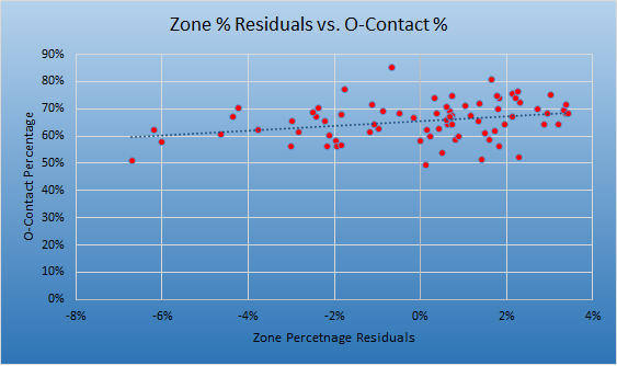
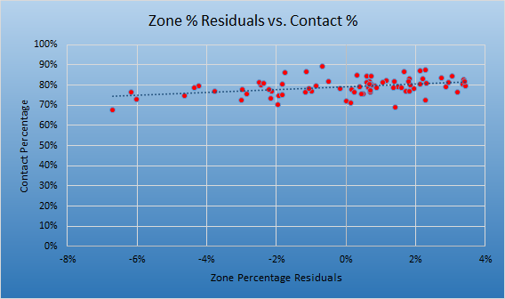
This is the the most telling set of graphs we’ve seen yet, in my opinion. The pitchers who get fewer “out of zone” strikes (represented by the positive residuals, remember) give up more contact outside the zone and as a whole compared to the pitchers who get more strikes out of the zone. So, what does this mean for batted ball tendencies?
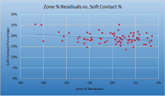
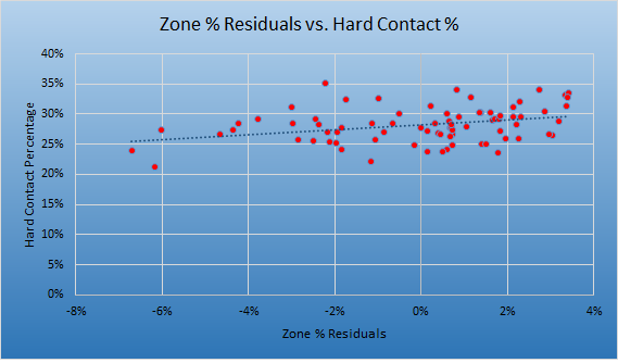
Now we finally see what the end-result difference is between the pitchers who get strikes out of the zone and those who don’t. Those pitchers who fail to induce strikes (via contact or whiffs) out of the zone give up less soft contact and more hard contact, in general, than their counterparts who can get batters to chase pitches. If you looked at the correlation between strike percentage and batted ball velocity, you’d see R values below 0.100. When you look at the relationship between these residuals and batted ball velocity, however, you get Rs up near or above 0.300. This goes to demonstrate the value of getting batters to chase.
Throwing strikes is good. Throwing strikes without throwing strikes is even better.
Next in my Pitching Series, I’ll examine how efficiency relates to success in the majors, and see what advantages efficient pitchers have as a whole.
Again, if you’re interested in learning more about how strike percentages, zone percentages, or any other control stats relate to success, shoot me a comment on here or on Twitter @mwojciak21.
All of my statistics are taken from Baseball-Reference, FanGraphs, Baseball Savant, and Brooks Baseball.
Thanks for reading, and be on the lookout for Part Three coming soon!

Pingback: The Pitching Series: Efficiency | Ball Eight
Доброй ночи.
Загорелась ошибка er95 на приводе FR-Z024-1.5K-UL. Аналогичные приборы ATV71EXC5C40N4, CIMR-VC4A0009HAA, CIMR-V7TC44P07 на насосах работают исправно.
Мастерскую нашел через bing здесь Ремонт SCHNEIDER AUTOMATION INC SERVO DRIVE POWER SUPPLY ONLY 410/PLS4, 110-206-PWR-SPPLY-ONLY
Всего хорошего!
LikeLike